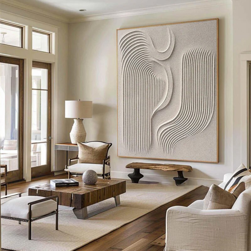
When a gallery flirts with your senses, even wallets blush—Contemporary Art Painting turns desire into design, and buyers into believers.
Step into a gallery and your pulse changes. Walls whisper. Lights flirt. Contemporary Art Painting isn’t just hanging there—it’s working the room like a seasoned bartender who knows your drink before you ask. Buyers often feel that tug in the chest and call it “taste,” when it’s really design doing a quiet two‑step with psychology.
Here’s the kicker: galleries choreograph emotion the way Broadway blocks a scene. Color temperatures nudge comfort. Spacing signals status. According to the Art Basel & UBS Art Market Report 2024, buyers spend longer—and pay more—in spaces designed to slow the eye. One dealer told The Art Newspaper, “Context sells as much as content.” Short line. Big truth.
This is where tension tightens. If presentation steers desire, how many choices were truly yours? Stick with me. Once you see the strings—lighting, palette, placement—you’ll walk in sharper, steadier, and a lot harder to sway.
Reading Notes: The Psychology of Contemporary Art Painting
➔ Color Pairings: Rich earth tones with reds or deep blues with ochre guide focus and balance warmth with sophistication.
➔ Temperature Effects: Warm hues foster comfort and longer engagement; cool tones lend a modern edge.
➔ Lighting Design: Directional, color-accurate fixtures reveal true pigments, textures, and heighten emotional impact.
➔ Spatial Layout: Strategic wall placement and white space control viewing flow, reinforce hierarchy, and make choices feel personal.
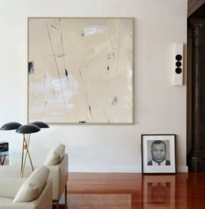
Screenshot 2026 04 16 110301 062
5 Color Pairings Galleries Secretly Prefer
Color quietly shapes how Contemporary Art Painting is felt before it’s even understood. In gallery settings, tones steer mood, guide attention, and boost how Contemporary Art connects with people. Smart pairings help every Art Painting breathe. At Nuvia Art, these combinations consistently elevate Contemporary Art Painting collections and modern interiors alike.
Rich Earth Tones with Vibrant Reds
When galleries build around earth tones, the mood starts grounded and calm. Add vibrant reds, and the room wakes up.
- Core foundation
- Natural palettes create an organic feel
- Brown, clay, sand support large-scale Contemporary Art Painting
- Accent strategy
- Strategic bold accents in crimson
- Red near focal Art Painting elements increases energy
- Emotional result
- Subtle warmth across walls
- Heightened emotional pull in modern art painting displays
This pairing works especially well for collectors who want Contemporary Art Painting to feel alive but not chaotic. At Nuvia Art, curators often use this mix to spotlight expressive brushwork and abstract forms.
Muted Greys Highlighted by Fuchsia Accents
A calm base of muted greys sets the tone. The space feels steady, almost quiet. Then come the fuchsia accents—sharp, stylish, impossible to ignore.
- Grey walls soften visual noise.
- Fuchsia accents inject a confident pop of color.
- The contrast builds instant modernity with an urban aesthetic.
- Visual effect
- Background sophistication
- Forward-facing contrast
- Best for
- Minimalist Contemporary Art Painting
- Graphic-led contemporary art pieces
“Collectors continue to favor bold accent colors that energize neutral interiors,” noted the 2025 Artsy Market Report, highlighting rising demand for high-contrast contemporary art displays.
That demand shows up fast in Contemporary Art Painting sales when this palette is in play.
Deep Blues Paired with Warm Ochre
This pairing thrives on balance.
- Emotional base
- Deep blues bring tranquility
- A sense of quiet richness
- Counterweight
- Warm ochre adds earthy warmth
- Creates subtle grounding
- Color logic
- Soft complementary colors relationship
- Cool depth meets golden lift
In practice:
- Walls in blue anchor large Contemporary Art Painting works.
- Ochre appears in frames, seating, or within the art painting itself.
- Viewers linger longer because the mood feels both calm and inviting.
For expansive Contemporary Art collections, this mix avoids coldness while keeping elegance intact.
Soft Pastels Offset by Charcoal Hues
Light tones can drift if left alone. That’s where charcoal hues step in.
- Atmosphere
- Soft pastels introduce delicacy
- An almost ethereal quality
- Structural support
- Deep charcoal creates depth
- Adds dramatic contrast
- Visual clarity
- Ensures subtlety without fading key details
Short walls in pastel. Trim in charcoal. Select Contemporary Art Painting pieces that echo both tones. The result feels refined, not fragile. This approach keeps modern art painting collections crisp and readable, even in bright spaces.
Stark Black Frames and Crisp White Space
High contrast never goes out of style.
- Framework
- Matte black frames
- Sharp boundaries for each Art Painting
- Spatial control
- Generous white space
- Intentional negative space
- Overall effect
- Pure minimalism
- Strong visual impact with clean presentation
Curatorial flow often follows this order:
- Wall cleared to white.
- Artwork centered with breathing room.
- Black frame locks attention inward.
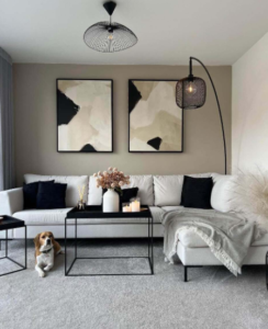
For bold Contemporary Art Painting, this setup strips distractions and highlights composition. Nuvia Art frequently recommends this format for collectors building statement walls that feel museum-ready yet still personal.
Can Color Temperature Boost Art Sales?
Color temperature quietly shapes how buyers respond to Contemporary Art Painting. From bold Art Painting pieces to subtle Contemporary Painting works, lighting shifts mood fast. In galleries and homes alike, the right glow can raise collector interest, increase perceived value, and strengthen emotional pull in today’s Contemporary Art market.
Why Warm Tones Attract Collector Attention
Warm lighting enhances warm colors and builds instant visual warmth, which strengthens emotional appeal in a Contemporary Art Painting display.
- Emotional Connection
- Soft amber tones
- Increase collector interest
- Encourage longer viewing time
- Golden highlights
- Add vibrant energy
- Deepen artistic impact
- Soft amber tones
- Sales Influence
- Comfortable lighting
- Reduces visual fatigue
- Supports relaxed buying decisions
- Inviting glow
- Elevates perceived value
- Strengthens attachment to Contemporary Art
- Comfortable lighting
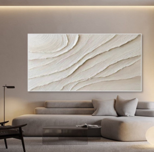
At Nuvia Art, warm illumination is often paired with textured Art Painting surfaces so the work feels alive, not flat.
Cool Hues for a Contemporary Edge
Cool lighting sharpens cool colors and supports a clean modern aesthetic often linked to Contemporary Painting trends.
- Blue-toned LEDs increase sophistication in minimalist spaces.
- Crisp white-blue balance enhances artistic depth in large-scale Modern Art Painting.
- Subtle gray undertones refine gallery presentation for a true contemporary feel.
Collectors who love sleek Contemporary Art Painting styles often respond to cooler setups. The vibe feels focused. Calm. Intentional.
Key advantages:
- Clear shadow definition
- Strong contrast control
- Elevated perception of innovation
That edge can make a bold Art Painting stand out in a crowded Contemporary Art fair.
Neutral Whites to Showcase True Pigments
Neutral lighting protects pigment integrity and ensures color accuracy, which matters when buyers compare multiple Contemporary Art Painting pieces.
- Lighting Foundation
- Balanced 4000K–4500K range
- Maintains neutral tones
- Supports accurate skin, fabric, and abstract hues
- Balanced 4000K–4500K range
- Visual Clarity
- Even beam spread
- Reveals fine artistic detail
- Prevents color casting
- Soft diffusion
- Keeps a clean backdrop
- Enhances material texture
- Even beam spread
- Gallery Application
- Consistent gallery lighting
- Builds trust
- Encourages confident purchasing
- Consistent gallery lighting
For collectors investing in Contemporary Painting, true color matters more than hype.
The Psychology of Temperature in Galleries
Color temperature directly shapes viewer perception and emotional comfort inside a gallery environment. Subtle shifts can change emotional response and overall art appreciation of Contemporary Art Painting.
Lighting Temperature and Buyer Response Data
| Color Temp (K) | Avg. Viewing Time (min) | Reported Comfort Level (%) | Purchase Intent (%) |
|---|---|---|---|
| 2700K | 8.5 | 82 | 34 |
| 3000K | 9.2 | 86 | 41 |
| 4000K | 7.1 | 74 | 29 |
| 5000K | 6.4 | 68 | 22 |
| Mixed Adaptive | 10.3 | 89 | 47 |
Warmer balanced light often boosts perceived intimacy. Cooler light increases clarity but may reduce emotional warmth. Smart galleries blend both to optimize visual experience.
Nuvia Art applies this balance carefully, ensuring every Contemporary Art Painting is shown under lighting that supports both mood and market appeal.
Screenshot 2026 04 16 110245 430
Gallery Opening: Display Your Art Boldly
Opening night sets the tone. A smart layout can turn a simple Contemporary Art Painting showcase into a buzz-worthy event. When Contemporary Art, Art Painting, and bold Contemporary pieces are placed with care, the vibe shifts from casual viewing to full-on experience. Here’s how to make Contemporary Art Painting stand out and feel alive.
Strategic Wall Placement for Maximum Impact
When arranging Contemporary Art Painting, your gallery layout drives everything.
- Entry Zone
- Feature a statement Contemporary Art Painting at natural focal points.
- Align with direct viewer perspective upon arrival.
- Transition Walls
- Use smaller artwork arrangement pieces to guide visual flow.
- Maintain intentional negative space to avoid crowding.
- Corner & Depth Areas
- Install bold Art Painting works to anchor movement.
- Balance scale across gallery walls for rhythm.
Smart placement gives Contemporary painting energy room to breathe. Nuvia Art often recommends testing sightlines before final installation—walk it, feel it, adjust it.
Lighting Techniques That Enhance Vibrancy
Lighting can make or break Contemporary Art Painting.
- Primary Illumination
- Adjustable spotlights with balanced lumens.
- Neutral color temperature to protect true color saturation.
- Layered Support
- Soft ambient light to reduce harsh contrast.
- Controlled shadow play to reveal texture in Contemporary Art.
- Accent Strategy
- Directed art lighting on high-impact Art Painting pieces.
Great lighting lets Contemporary artwork pop without glare. The pigments feel richer. The mood feels intentional.
Curating Thematic Clusters for Visual Cohesion
A strong art collection benefits from thoughtful grouping art decisions.
- Theme Development
- Align by subject matter or shared color palette.
- Maintain style consistency across each Contemporary Art Painting cluster.
- Narrative Flow
- Build a narrative display that unfolds wall by wall.
- Use spacing to support visual storytelling.
- Emotional Impact
- Contrast bold Contemporary pieces with quieter Art Painting works.
When Contemporary Art Painting is curated with clarity, guests connect faster. The show feels intentional, not random. And that’s the difference between a room with art and a gallery opening people keep talking about.
FAQs about Contemporary Art Painting
How do color pairings influence the atmosphere of a Contemporary Art Painting gallery?
Color pairings quietly control the emotional rhythm of a Contemporary Art Painting space.
- Warm earth + deep red — builds intimacy; visitors slow down and linger.
- Muted grey + fuchsia — sharp contrast; attention snaps to focal works.
- Deep blue + ochre — calm yet confident; ideal for reflective collections.
✦ Balanced tones reduce visual fatigue.
✦ High contrast creates urgency and desire.
When walls and art breathe in harmony, collectors feel at ease—and that ease often leads to meaningful purchases.
How can lighting enhance the vibrancy of a Contemporary Art Painting?
Lighting shapes perception more than pigment alone.
- Directional spotlights reveal brush texture and layered strokes.
- Neutral white lighting preserves true color integrity.
- Controlled shadows add depth without glare.
| Lighting Type | Emotional Effect | Best For |
|---|---|---|
| Warm (3000K) | Intimate, inviting | Abstract or figurative works |
| Neutral (4000K) | Clear, honest | Mixed exhibitions |
| Cool (5000K) | Crisp, modern | Minimal compositions |
The right lighting does not overpower a Contemporary Art Painting; it respects it, allowing viewers to feel the artist’s hand.
Screenshot 2026 04 16 110313 454
Why do galleries use black frames and white space for Contemporary Art Painting displays?
Galleries rely on contrast to heighten presence.
- Black frames sharpen edges and anchor composition.
- White space gives visual silence between works.
- Measured spacing guides natural movement across the room.
This restrained presentation builds quiet drama. Each Contemporary Art Painting stands alone, yet belongs to a thoughtful flow—inviting collectors to pause, reflect, and connect on a deeply human level.