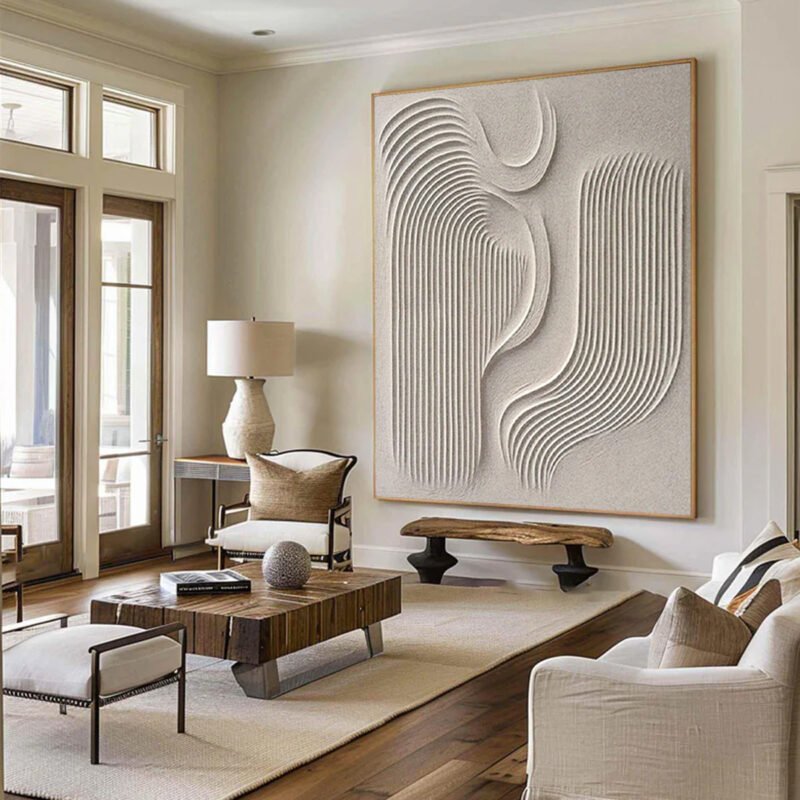
Turn blank walls into quiet power moves with Minimalist Oil Painting Decor—where chic serenity meets bold, artful confidence.
Minimalist Oil Painting Decor can feel like the little black dress of your living room—effortless, sharp, and secretly powerful. But pick the wrong piece and the vibe goes sideways fast. Too small? It floats like a lost kite. Too loud? There goes your calm. You want chic serenity, not visual chaos.
Here’s the kicker: scale, texture, and color mood matter more than price tags. A soft neutral canvas can hush a noisy space; bold brushwork can anchor a drifting room. It’s less about filling a wall and more about setting a tone—like choosing the soundtrack for a dinner party.
The National Endowment for the Arts notes that engagement with visual art supports emotional well-being. That’s not fluff—that’s data.
So before you click “add to cart,” let’s make sure your walls tell the right story.

5 Steps! Selecting Your Ideal Minimalist Oil Painting Decor
Minimalist Oil Painting Decor sounds simple, yet picking the right piece can totally shift your vibe. A smart choice balances room layout, scale, texture, and light without overthinking it. Let’s break down how to choose oil painting decor that feels calm, stylish, and right at home.
What’s Your Room’s Focal Point?
Start by mapping your room layout in layers:
- Architectural anchors
- Architectural features like fireplaces, built-in shelves, or large windows
- Strong lines that already pull the eye
- Environmental influence
- Direction of natural light
- Open or tight wall space
- Style context
- Current existing decor
- Dominant color scheme
- Areas lacking visual interest
If your sofa is bold and centered, your Minimalist Oil Painting Decor should support it, not compete. A soft-toned oil painting with subtle brushwork can enhance flow. In rooms with heavy detailing, minimalist wall art gives breathing room.
Brands like Nuvia Art curate Minimalist Oil Painting Decor specifically designed to reinforce focal points rather than distract from them. That balance keeps oil painting decor feeling intentional instead of random.
Assessing Scale: Finding the Perfect Canvas Size
Scale is where many people miss the mark. The relationship between wall dimensions, furniture size, and ceiling height determines ideal artwork proportion.
Consider this practical guide:
| Wall Width (inches) | Recommended Artwork Width | Ideal Viewing Distance | Visual Effect |
|---|---|---|---|
| 48–60 | 30–40 | 5–7 ft | Balanced and calm |
| 60–72 | 36–48 | 6–8 ft | Strong presence |
| 72–96 | 48–64 | 8–10 ft | Statement look |
| 96+ | 60–72 | 9–12 ft | Gallery-style impact |
For balanced Minimalist Oil Painting Decor, aim for artwork spanning about two-thirds of the available wall width. Too small creates awkward negative space. Too large disrupts visual balance.
Also factor in room scale. High ceilings allow taller vertical oil paintings. Compact spaces benefit from horizontal minimalist oil artwork that visually widens the room.
Style Match: Pairing Painting Lines with Your Furniture
To align painting and furniture, think in design layers:
- Identify your furniture style
- Mid-century: tapered legs, soft curves
- Modern: sharp edges, clean frames
- Scandinavian: organic forms, pale woods
- Observe structural language
- Dominant geometric shapes
- Flowing organic forms
- Translate into painting traits
- Light line weight for airy rooms
- Bold lines for structured spaces
Minimalist Oil Painting Decor with gentle, sweeping strokes pairs beautifully with curved sofas and rounded coffee tables. Crisp linear oil painting decor echoes square shelving and metal frames.
Good design follows core design principles. Keep visual harmony at the center. If your decor aesthetic is already busy, go subtle. If it’s sleek and clean, structured minimalist art can amplify the mood.
Nuvia Art offers collections that categorize oil painting decor by line direction and geometry, making this matching process refreshingly easy.
Texture Check: Smooth vs. Impasto Finishes
Texture shapes the entire overall feel of a room.
• Smooth finish
- Minimal surface texture
- Soft light reflection
- Calm, refined presence
• Impasto finish
- Thick paint buildup
- High visual depth
- Noticeable tactile quality
In bright rooms with strong natural light, heavy impasto creates dramatic shadows. In softer spaces, smooth Minimalist Oil Painting Decor enhances clarity and quiet energy.
Texture also signals artistic style. Sleek minimalist oil artwork works great in contemporary homes. Textured oil painting decor brings warmth to cool-toned interiors.
Material choices matter too. The materiality of canvas and paint affects durability and mood. If you like subtle sophistication, go smooth. If you want a little edge, choose depth.
Installation Tip: Hanging Height for Maximum Impact
Hanging art isn’t guesswork; it’s about structure and alignment.
- Establish baseline
- Standard eye level: 57–60 inches from floor to artwork center
- Adjust for context
- Account for furniture placement below
- Respect overall room proportions
- Refine positioning
- Check viewing angle from seating areas
- Maintain clear artwork visibility
When placing Minimalist Oil Painting Decor above a sofa, leave 6–10 inches between furniture top and frame bottom. This keeps the composition tight and grounded.
Finally, step back. Observe visual flow across the wall. The painting should feel connected to its surroundings, not floating. Thoughtful composition ensures your Minimalist Oil Painting Decor anchors the space naturally.
When done right, minimalist oil artwork doesn’t scream for attention. It just fits. And that quiet confidence is exactly what makes oil painting decor so powerful.
4 Factors That Define Minimalist Oil Art Quality
Minimalist Oil Painting Decor feels simple at a glance, yet the quality behind it runs deep. When oil painting, minimalist style, and wall decor meet, small technical choices shape the final vibe. Here’s what truly defines lasting minimalist art decor.
Pigment Purity and Its Visual Impact
In Minimalist Oil Painting Decor, color does the heavy lifting. The standard starts with pigment quality, and that choice ripples through everything else.
- Core elements of high-level paint performance:
- Color saturation
- Rich but controlled intensity
- No muddy undertones
- Lightfastness
- Resistance to fading under sunlight
- Stable tones over time
- Hue consistency
- Even color from tube to canvas
- Predictable mixing results
- Color saturation
Within minimalist oil painting, subtle shifts matter. Strong vibrancy doesn’t mean loud; it means alive.
- High opacity supports bold geometric blocks.
- Balanced transparency allows soft layering without clutter.
- Clean blending keeps minimalist wall art crisp.
When pigment purity drops, Minimalist Oil Painting Decor loses its calm authority. Clean tones keep oil painting decor looking sharp, not washed out.
Canvas Support: Cotton vs. Linen Comparison
Canvas material quietly shapes the outcome of oil painting decor. The debate between cotton canvas and linen canvas isn’t hype; it’s practical.
- Canvas material breakdown:
- Cotton canvas
- Smoother weave texture
- Budget-friendly
- Easier for beginners
- Linen canvas
- Higher durability
- Stronger fiber tension
- Refined surface feel
- Cotton canvas
Preparation counts just as much as fabric.
- Surface setup:
- Careful priming
- Seals fibers
- Controls absorption
- Thoughtful surface preparation
- Light sanding
- Even gesso layers
- Careful priming
Minimalist Oil Painting Decor benefits from a stable base. Linen tends to resist sagging over time, while cotton works well for controlled studio settings. For minimalist art decor, that surface stability keeps clean lines truly clean.
Brushwork Precision: The Role of Stroke Consistency
Minimalist oil painting thrives on restraint. That’s where brushstroke technique steps in.
- Stroke control hierarchy:
- Stroke consistency
- Uniform direction
- Balanced pressure
- Surface texture
- Smooth for flat color fields
- Slight grain for subtle depth
- Layering control
- Thin passes
- Measured build-up
- Stroke consistency
In oil painting minimalist compositions, uneven application distracts fast. Precision supports detail without fuss.
• Clean edges
• Controlled application method
• Intentional expressiveness
Minimalist Oil Painting Decor isn’t about showing off skill. It’s about quiet confidence, where every stroke feels placed on purpose.
Protective Varnish: Longevity and Color Preservation
After drying, protection matters. A quality protective varnish seals the effort.
- Varnish functions:
- Surface defense
- Dust resistance
- Scratch buffering
- UV protection
- Shields against light damage
- Enhanced color stability
- Maintains tone balance
- Reduces yellowing
- Surface defense
Types of artist varnish vary in finish:
- Matte for soft minimalism
- Satin for gentle glow
- Gloss for heightened depth
Strong aging resistance keeps minimalist wall decor looking fresh years later. In Minimalist Oil Painting Decor, protection isn’t flashy. It simply preserves the calm, steady beauty that makes oil painting decor worth hanging on to.
Which Color Palettes Suit Minimalist Oil Art?
Minimalist Oil Painting Decor isn’t just about less stuff on the canvas; it’s about smarter color choices. When oil painting meets minimalist decor, tone does the heavy lifting. The right palette shapes mood, sharpens space, and keeps your walls feeling calm instead of crowded. Let’s break down what actually works.
Monochrome Elegance
When building Minimalist Oil Painting Decor around a single hue, structure matters more than color variety. A monochrome plan keeps things tight and intentional.
- Core Palette
- black and white create crisp structure in oil painting decor.
- shades of gray soften contrast without losing edge.
- A single color base builds unity across minimalist decor themes.
- Depth Through Variation
- Use subtle variations in tone to highlight brush texture.
- Shift from matte to light gloss for quiet dimension.
- Layer diluted oil washes to avoid flatness.
- Visual Outcome
- Strong sense of sophistication
- Clean minimalist aesthetic
- Calm, steady rhythm in Minimalist Oil Painting Decor
This approach suits modern apartments, studio lofts, or workspaces where oil painting should feel grounded, not loud.
Earth-Tone Serenity
For warmer Minimalist Oil Painting Decor, natural shades bring ease into the room.
- Foundational Hues
- beige and soft browns as base layers
- Muted greens for balance
- Touches of terracotta for warmth
- Emotional Effect
- These natural hues create a calming effect.
- The palette adds an organic feel without clutter.
- Oil painting decor blends smoothly with wood, linen, and stone.
- Application Flow
- Start with a beige ground.
- Add brown tonal blocks.
- Introduce green accents in thin strokes.
- Finish with restrained terracotta highlights.
The result? Minimalist Oil Painting Decor that feels relaxed and lived-in, not staged.
High-Contrast Accents for Visual Interest
Sometimes Minimalist Oil Painting Decor needs a spark.
- Base Strategy
- Neutral background.
- Carefully placed bold colors.
- Accent Control
- Insert vibrant pops through strategic placement.
- Keep each bright tone tied to a single focal point.
- Use dynamic contrast to create visual depth.
- Design Balance
- Too many bold strokes break clarity.
- One strong accent keeps modern appeal.
In oil painting for minimalist decor, contrast should feel deliberate. Clean. Confident. That’s how Minimalist Oil Painting Decor stays sharp without losing its cool.
FAQs about Minimalist Oil Painting Decor
How can Minimalist Oil Painting Decor shape a modern living space?
A room breathes when art knows restraint.
- Visual calm that steadies the mind after long days
- Quiet emphasis on light, walls, and furniture lines
- A sense of order, even when life feels like:
Warning: Undefined array key “candidates”… line 89
The simplicity absorbs tension and gives the eye a place to rest.
What size of painting feels right above a sofa or console?
The body reads proportion instinctively.
① Artwork around two-thirds of wall width feels balanced
② Too small creates unease; too large feels overbearing
③ Distance matters—step back, notice posture, notice breath
When alignment feels natural, the space settles.
Why does pigment purity matter in Minimalist Oil Painting Decor?
Color behaves like emotion—clarity matters.
- Clean pigments hold steady under daylight
- Soft transitions avoid visual noise
- Longevity without fading or distortion
Even in moments that echo “Trying to access array offset on value of type null”, pure color stays composed.
How do canvas choices affect texture and mood?
A brief contrast says enough:
| Canvas | Touch | Emotional Tone |
|---|---|---|
| Cotton | Smooth, gentle | Quiet ease |
| Linen | Firm, refined | Confidence, permanence |
Texture shapes how light moves, how silence feels, how a room recovers from its own small errors—
Deprecated: str_replace()… line 91—and still looks whole.