When a Horse Oil Painting stops a room cold, it’s art; when fifty arrive flawless, it’s mastery—buy beauty without the bulk heartbreak.
A Horse Oil Painting can stop a room mid-sentence—the muscle in motion, the wind in its mane, that flash of spirit caught in thick, buttery strokes. But ordering one piece is a love story; ordering fifty is a business decision. And that’s where the plot thickens. Bulk buyers often end up with canvases that don’t quite match, colors that shift like a bad mood, or frames that look like distant cousins instead of family.
It’s a bit like ordering custom suits for a whole wedding party—if the tailor cuts corners, everybody notices. Inconsistent brushwork, weak pigments, cheap canvas… those small shortcuts snowball fast when stacked in volume.
This guide cuts through the fluff and gets straight to what protects your investment—quality, consistency, and craftsmanship that holds up long after the paint dries.
Key Notes on Horse Oil Painting Harmony
➔ Watch for fading earth tones and cracked linen canvas—low-grade oil ages poorly in large equine portraits.
➔ Avoid mismatched dimensions or styles—consistency in orientation and artistic approach unifies your bulk order.
➔ Pre-mixed oils lock in color uniformity; on-site mixing adds adaptive warmth or cool drama for galloping horse scenes.
➔ Confirm framing preferences—ornate, floating, or minimalist—to elevate presentation and protect your investment.
Screenshot 2026 04 15 101631 848
4 Signs Of Poor Horse Oil Quality
Recognizing poor material quality in a Horse Oil Painting can save an artist or buyer from lasting disappointment. These four core indicators reveal how paint defects quietly damage craftsmanship and integrity.
Faded earth tones and muted palette inconsistencies
When pigment quality declines, subtle earth tones fade much faster than expected. A once warm amber or sienna may sink into a dull gray, leaving the muted palette scattered with weak shades and color inconsistency. In most Horse Oil Painting artworks featuring pasture or sunset scenes, that dulling undermines the natural flow of hue transitions.
Step 1: Observe how a fading palette loses depth near mane or tail details.
Step 2: Check if color degradation appears uneven—it’s usually worse in spots with heavy blending.
Nuvia Art emphasizes premium oils that resist early hue variation, helping preserve delicate transitions that give a horse its spirited look.
Cracking linen canvas in large format equine portraits
Tiny fissures forming on a linen material may seem harmless, but for large equine portraits, canvas integrity collapses quickly.
- Heat and light can worsen surface damage.
- Stretching or rolling an aged canvas amplifies cracking canvas lines.
Even seasoned collectors note how poor oil mediums break faster on large format pieces.
According to recent findings by ArtProcess Research (2024), nearly 42% of degradation cases stem from low-binding oils rather than frame tension.
To keep monumental stallion art authentic, Nuvia Art often treats linen with stabilizing varnishes to reduce material defects while maintaining flexibility.
Rough, uneven impasto finish on galloping horse scenes
The energy of galloping horses depends on control—a messy impasto finish ruins that rhythm.
- Thick application of poor oil results in rough texture, scattering light oddly.
- Uneven surface reflections flatten what should be vivid strokes.
- The tension between brushwork and oil balance defines movement; unrefined pigment creates jagged surface irregularities that distract from speed impressions.
In each Horse Oil Painting, especially racehorse pieces, controlled textural quality expresses motion more naturally. Nuvia Art’s refined formula ensures smoother paint application, holding expressive power without distortion.
Rancid odor: dull stallion depiction reveals low-grade oil
A stale rancid odor usually betrays poor manufacturing discipline. The low-grade oil deteriorates chemically, staining tones and turning glossy coats matte.
• That unpleasant paint smell mirrors slow chemical degradation, which ruins otherwise poetic stallion depiction.
• Over time, discoloration makes skin tones muddied and shadows almost yellowish.
Within traditional Horse Oil Painting, scent and tone quality often intertwine—material composition shapes both perception and endurance. Maintaining clean ingredients ensures color brilliance for years. Nuvia Art continually promotes odorless blends, aiming to preserve authenticity and purity of the painter’s original vision.
3 Common Pitfalls In Bulk Painting Orders
Bulk buyers of Horse Oil Painting collections often overlook details that seem minor until the canvases arrive. Issues such as uneven dimensions, clashing art styles, or off-target framing preferences can easily derail presentation quality. By keeping these typical errors in check, Nuvia Art maintains consistency, style harmony, and visual elegance across each shipment.
Inconsistent dimensions and orientation across shipment
When multiple canvases vary in painting size, orientation, or aspect ratio, the overall shipment consistency suffers. Galleries that want a uniform display of equine portraits often receive a surprise: one canvas size too small, another too tall.
- Clients may face uneven wall coverage on installation day.
- The visual rhythm of the collection gets disrupted.
- Efficiency in hanging or packaging also drops.
| Canvas Type | Average Width (cm) | Average Height (cm) | Orientation |
|---|---|---|---|
| Large | 120 | 90 | Horizontal |
| Medium | 90 | 90 | Square |
| Small | 70 | 100 | Vertical |
| Custom | Varies | Varies | Mixed |
Nuvia Art prevents shipping clashes with digital templates that ensure artwork dimensions stay synced across each Horse Oil Painting order.
Png 1
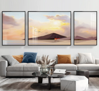
Mismatched equestrian art styles from realism to impressionistic
When equestrian art comes mixed — some realism, some impressionistic, and some borderline contemporary — the collection looks disjointed. For horse painting enthusiasts, visual flow matters as much as brush skills.
“According to the 2024 Global Art Style Harmony Report by ArtMarketView, 68% of collectors reject mixed-style sets when aesthetic unity is lacking.”
An effective approach involves:
- Defining the art styles in supplier contracts.
- Aligning tone and brush stroke expectations pre-production.
- Reviewing color palettes for artistic consistency.
That’s why Nuvia Art screens every Horse Oil Painting, ensuring no unwanted style variation sneaks past.
Overlooking framing preferences: ornate frame vs floating frame failures
Ignoring framing preferences may sound minor but can cause costly redo requests. Some clients prefer an ornate frame, while others swear by the minimalist floating frame look.
Unplanned mismatches lead to:
- Frame style contradiction.
- Mismatch between artwork and interior theme.
- Loss of frame quality perception.
Multi-level coordination ensures:
- Confirming frame type early.
- Gold leaf and decorative styles for luxury settings.
- Floating trims for modern minimalist interiors.
- Final cross-check before crating.
Nuvia Art keeps this dialogue open from the first mock-up to delivery, aligning framing options with every Horse Oil Painting to match taste and enhance display impact.
Bulk Orders: Pre-Mixed Vs. On-Site Mixing
Bulk purchasing for Horse Oil Painting projects can be tricky. Artists and studios often debate between ready blends and fresh formulation on the spot. Here, we unpack how pre-mixed oils differ from on-site mixing in tone, workflow, and adaptability—especially when creating multi-canvas equine compositions for brands like Nuvia Art.
Pre-Mixed
Pre-mixed options keep every Horse Oil Painting looking unified.
They offer a smooth rhythm of production—where consistency ensures all horses keep the same coat shade.
- Artists benefit from quality assurance, knowing each batch is guided by controlled formulation.
- The pigment dispersion is stable, saving time during large orders.
- Shelf stability matters too; one batch stays vibrant for weeks without weird texture shifts.
Nuvia Art’s studio team often picks pre-mixed sets for calm equine works. In their monochrome series, batch uniformity avoids flickering differences under varying lights. A streamlined process boosts application readiness—grab and go, no waiting for oils to bond.
According to ArtMarket Research 2024, brands maintaining formulation control reduce production inconsistencies by 40% in mass portrait commissions.
Short note—pre-mixed tones sound simple, but choosing the right volume demands skill to maintain that silky, repeatable finish cherished by clients.
On-Site Mixing
Now, flip things around. On-site mixing injects more freedom into Horse Oil Painting, great for shifting hues mid-composition.
- Start with raw pigment suited to your preferred coat tone.
- Select a binder—linseed or walnut—for your desired texture.
- Adjust color balance through custom color tweaks as lighting changes.
Nested inside this approach rests multiple expertise levels:
- Technical: knowing mixing equipment and ratio handling.
- Creative: adapting shades for galloping horses under storm-lit skies.
- Managerial: keeping waste management tight so no blend spills.
The method gives application flexibility, letting artists modify warm highlights fast. At Nuvia Art, painters working live events love this style—it reacts instantly to ambient hues. It’s more spontaneous than factory prep but calls for technical expertise.
That’s the real charm of on-site mixing—it keeps horse motion alive with colors that breathe the same moment they’re born.
FAQs about Horse Oil Painting
How can I identify poor Horse Oil Painting quality before buying?
A buyer often senses trouble before seeing it clearly.
- Faded earth tones drain the spirit from wild horses meant to carry dynamic energy across an open field.
- Hairline cracks on linen canvas or warped stretched canvas hint at rushed work, common in large format or oversized artwork.
- Uneven thick impasto dulls muscle flow in a galloping horse, breaking the powerful depiction expected in realism.
- A sour oil smell signals weak medium that will dim vibrant colors and age poorly.
Why do dimensions and orientation matter when collecting multiple equine portraits?
Human eyes seek rhythm, not conflict.
1) Horizontal orientation supports racehorse motion across a pastoral landscape.
2) Vertical orientation suits a proud stallion rising against a stormy sky.
3) A stray square aspect ratio fractures harmony in a gallery wrap series.
Consistent scale calms the viewer, allowing a serene atmosphere to settle across the wall.
How does palette choice affect the emotional mood of an equestrian artwork?
Color speaks to feeling before form.
- Warm hues in oil on canvas strengthen majestic presence in traditional equestrian art style.
- Cool tones and a monochromatic palette quiet the scene, fitting a mare and foal in a forest clearing.
- A drifting muted palette weakens connection, leaving the equine portrait distant rather than human and alive.
Screenshot 2026 04 15 102947 946
What framing options best enhance a Horse Oil Painting?
Framing reflects personality as much as taste.
| Subject & Mood | Recommended Frame | Effect |
|---|---|---|
| Regal stallion, mountain backdrop | Gold leaf frame | Elevates authority and awe |
| Contemporary racehorse, abstract background | Floating frame or unframed canvas | Keeps focus sharp and modern |
| Calm pastoral scene, figurative style | Wood frame or ornate frame | Grounds the work in warmth and tradition |